Website Design Dilemmas
Where do you place the navigation
toolbar?
by Vikas Kamat
First Online: August 26, 2001
Page Last Updated: January 12, 2026
Website Design Dilemmas
Balancing Mystery and Usability | Navigational Toolbars | Content Rotation
When I undertook the redesign of Kamat's Potpourri in early part of the year 2001, I undertook a study of usage patterns and surfing patterns of a cross section of users. I also read several published reports on web usability and independently confirmed many of those findings. A brief summary of my lessons:
-
People scan the page left to right
-
People literally browse the web pages rather than read them
-
The center of the page is what gets the most attention -- even to read the content at the lower part of the screen, people tend to scroll down, bring the bottom part to the center of the screen and then read them.
The last item was of particular interest to me, because our navigational toolbar was at the bottom of the page as shown below:
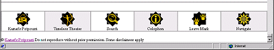
Old way: Navigation at the bottom of every page
| Most people never knew there was a navigational tool
bar at the bottom, or did not use it because of its poor usability.
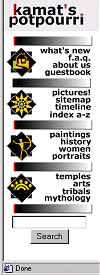
I prototyped a vertical toolbar (shown on the right), and the items
on the toolbar suddenly started getting attention.
Thumb Rule: Put navigation where users can see and reach. |
|
|
New way: Vertical Navigation |
![]()
Also, instead of placing a link to the search engine, I allowed the users to directly search the website from each and every page (see the search button in the picture). Since the redesign, the search is the most used page on Kamat's Potpourri, more popular than even the main entrance page or the section on erotica!
This is very perplexing. Why do people use Kamat Search? The only thing they can search is our content, and there is no content they can find that they cannot find using Google. Go figure.
Thumb Rule: If you have content, make it easily searchable.
![]() A tip for the Amateur Webmaster: Google and SearchButton provide inexpensive ways for small
publishers to implement a site search.
A tip for the Amateur Webmaster: Google and SearchButton provide inexpensive ways for small
publishers to implement a site search.
![]()
Position of the Navigation Toolbar
My studies indicated (perhaps influenced by their excessive Yahoo! usage) that the more static of the navigation is best located on the left hand side of the page, while more context sensitive navigation is better placed on the right hand side. I got conflicting feedback on this query, and I went with my intuition and placed the links to table of contents and navigation within a section (called the Poker Face) on the right hand side.
Due to the increasing demands of the web advertisers, you may not be at freedom to place the navigation toolbars wherever you want, but at least you can be consistent throughout the site.
Website Design Dilemmas
Balancing Mystery and Usability | Navigational Toolbars | Content Rotation
See Also:
- Jacob Nielson on Usability -- I agree with most of the things he says, and have learnt a lot from practicing what he preaches.
- Google Site Search -- an inexpensive way to implement a site search for your site.
Books on Designing Web User Experiences